Anime at Studio City
CREATIVE DIGITAL CAMPAIGN
Anime is an extremely popular subculture in Asia and well-known franchises often partner with companies to produce real-life experiences to attract the show’s fans. For Studio City Resort in Macau, we went beyond that - we made it possible to turn yourself into the protagonist of your own anime story by creating a campaign centered around two major digital activations that would transform you into an anime character in more ways than one.
My role was to lead the UX and UI designs of both digital executions, oversee the narrative + visual content of the anime, and manage parts of the technical design production, as well as contributing to the general creative concept and direction.
AGENCY Ogilvy – YEAR 2019 – DURATION 6 MONTHS – LOCATION MACAU
TEAM Manolis Perrakis - Tech Lead, Stratos Efstathiou - Art Director, Soenar Santoso - Art Director, UI development, Production + Development - Meitu, Wenpeng Xiao, Illustrator - Mike Chan
ROLE UI + UX DESIGN, DIGITAL PRODUCTION, CREATIVE DIRECTION
Scan this QR code to try it yourself!
CONCEPT
One click, AI-generated Manga.
Building a bespoke selfie filter API.
We were inspired by how the convincingly photo augmentation filters on popular selfie apps like SNOW and Meitu were able to generate unique cartoon versions of the user, so we decided to build one that took it even further - creating a fantasy character true to your own likeness.
Creative applications of AI.
After validating for the tech feasability, we had already in mind the creative application of it - the idea of a one-snap instant manga, where you magically appear as the protagonist in the pages of your heroic Anime journey.
Challenge
Brief : create a digital and on-site campaign based on the theme of Anime for the luxury entertainment resort based in Macau.
Insight
Anime is extremely popular in Asia for its ability to pull you into fantastical universes and its compelling storytelling style. How can we immerse the user even further into the world of Anime?
Solution
An integrated O2O compaign with three core digital executions:
A h5 minisite featuring an anime-fication ‘filter’
A WeChat mini-app that instantly generates a manga featuring yourself
An immersive kinect game where you pilot a mecha robot, played on a 20-meter LED screen
PROCESS
DISCOVERY
Precedent tech & experiences.
Tech feasibility check.
In order to validate the concept, we first had to confirm the tech was feasible. We found an existing image processing machine that had been taught on thousands of images of anime girls to create convincing AI reproductions from this data set alone.
Competitor app analysis.
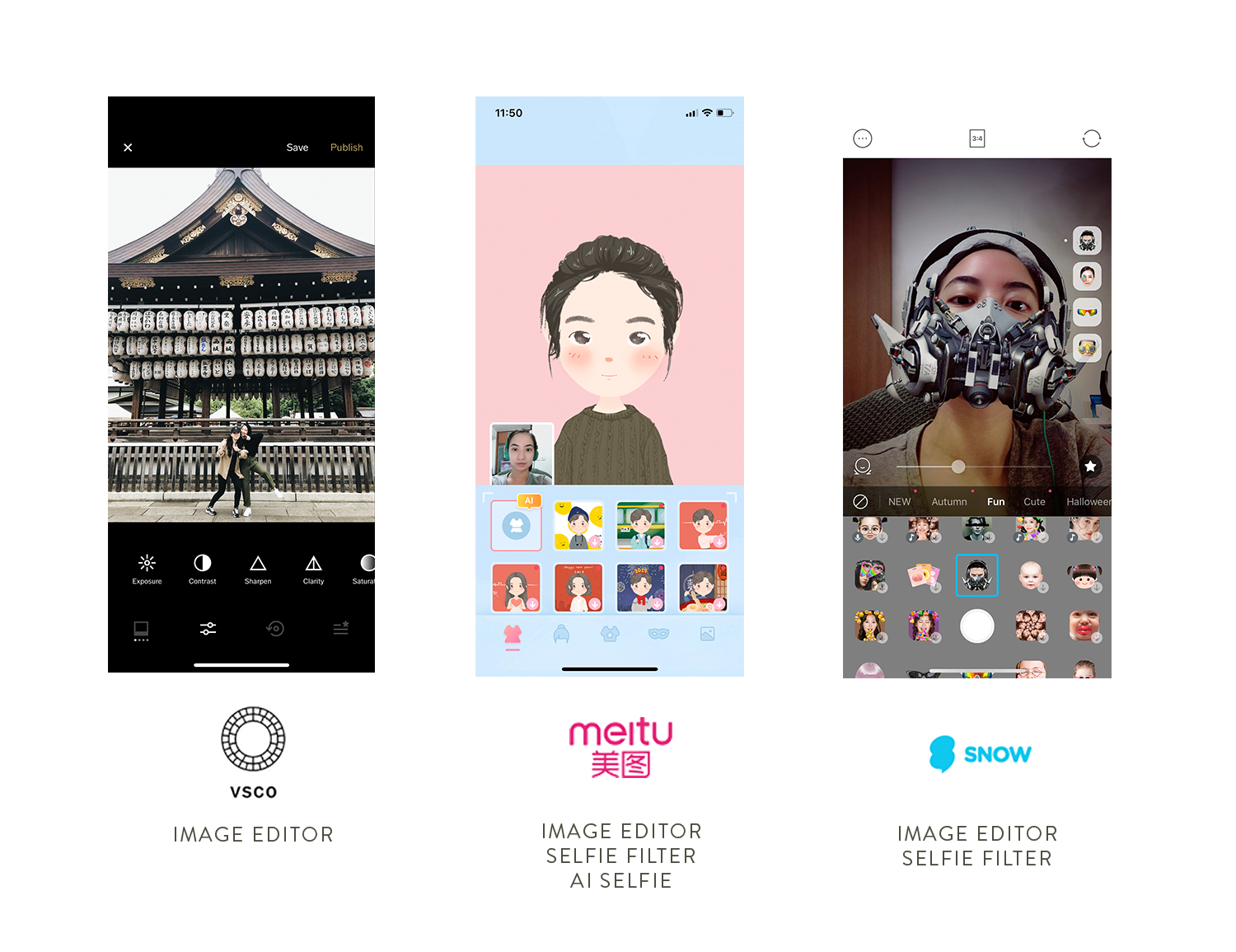
We examined three different photo editing apps aimed at three different markets - VSCO, Meitu, & Snow. We broke down why were successful, and where they could stand to improve.
VISUAL DEVELOPMENT
Concept & art direction.
Become an Anime Hero
All our ideation was based on the Anime trope of the protagonist becoming the hero through a series of trials and tribulations. The concept was to create an experience that allowed users and visitors to do the same thing in real life. We did a number of visual treatments to find the right look and feel for this concept.
Drafting the Anime story.
Limited resource prompted that I write, plan, and map the comic with sketch storyboards. You can see some examples of the visual development process below ↓. As a sometimes-illustrator and sometimes-writer, getting to drive this part of the project was super fun.


Creating an anime universe, a manga, and two mini apps – in record time.
We pulled off a feat in executing this content-heavy project. To produce the art needed for these mini sites, we worked with illustrator Mike Chan who was our principal visualizer, as well as hiring an ex-Miyazaki animator based in Japan to design our original Anime characters.
Here’s an example of some of the final manga panels →.
UX + UI
Playful digital.
Lean user flows.
Because this is a promotional project hosted built as a browser web-app and not a full native app, we wanted to keep the scope and flows as minimal, simple, and instantly accessible as possible.
Combining app typologies.
Our end product was a two-pronged digital experience, a hybrid of a e-toon reader and a selfie editing platform. The challenge was to make both activations feel seamless and parts of a whole.
Experience design goals:
Instant, immersive transformation into the Anime world. Emphasis on seamlessly guiding you from selfie filter to the webtoon reader.
Streamlined and uncomplicated
UI styling that feels delightful and playful and aligns with the overall campaign branding
Drive incentivised engagement / rewards collecting earned from participation to spend on-site
Make sure performance + execution was solid, making the experience cool and beautiful enough to share.
DESIGN & BUILD
A hybrid H5 mini-site.
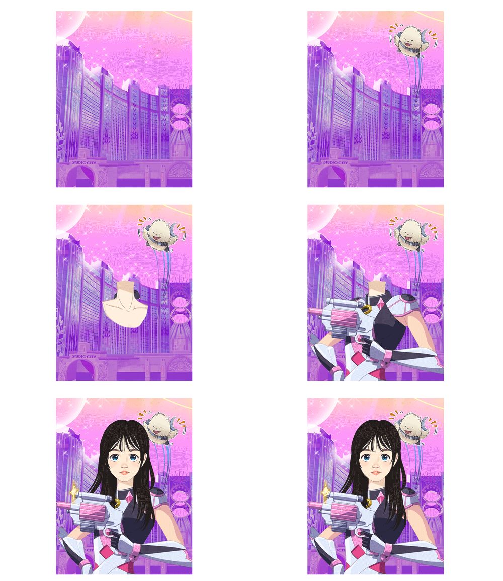
Building the generative image production.
We had to design this filter’s blueprints, that is to break the image down into parts to be assembled again programmatically, in a way that would optimize size and minimize loading times.


